Monday, August 31, 2009

monday color combo

i know many out there either love blue or hate blue. i am a lover. lately i am head over heels for dark blue, midnight, navy, peacock...so blue it almost looks black. delicious. blue works a right treat with brown. and sure, many of you also say..."oh that combo was sooo 2 years ago". and you would be right. but i think b/c there are so many shades of blue and brown it can stay fresh and relevant. like turquoise and milk chocolate, sable and slate blue, midnight and camel. throw in some kelly or lime green and you have fresh and current. you feel me.

images via xjavierx, housebeautiful, patriciagray, decor8, gvdesigns

Sunday, August 30, 2009

hot mess

note to homeowners everywhere: there's collecting....and then there's hoarding-

i'm just sayin' perhaps a little editing wouldn't hurt. you know, a rotation of things might be nice.
achoooooo!!!!!!

from here.

Saturday, August 29, 2009

really, maine cottage?

where do you get off charging these prices for wood and paint and basic design?


2,690 dollars for this??
my dad, who is a self taught carpenter (much like his hero J.C.) could make this in a weekend for half that price. couldn't you dad? and if you aren't as lucky as me to have a dad who builds shit i am sure you could find something in a junk shop very similar.


1,990 dollars...what the?!?!?! really!?!?


are you kidding me blue desk? you cost nearly 3,000 dollars???

check this out maine cottage...
my buffet:

farrow and ball's hague blue paint:
yeah, that's right! that buffet up there is going to get a coat of farrow and ball's hague blue and it will cost a whole lot less than 3,000 dollars.

what's that seafoam green country charmer???..you cost OVER three thousand dollars? well that is fucking ridiculous.

blue wicker writing desk YOU are over three thousand dollars too????! does maine cottage know that you can find a lot of these pieces on craigslist for about 20 bucks in some cases and all they need is some minor repair and paint?

little orange-y red wicker table you ARE cute but at 1,300 dollars you can suck it!


now we're talkin..this is an ADORABLE table...how much?? wait let me guess...ummm....250? no? (table shakes head) hmmm...ok ok....whew...350?? (table smiles uncomfortably) NO?!?! MORE?!??! five hundred??? (silence) OVER FIVEHUNDRED?!?!? (table whispers in embarrassment) 890 dollars. (MFaMB faints)


490 dollars (no words)


590 dollars (just threw up in my mouth)


690 dollars (no pulse)


Friday, August 28, 2009

everyone's talkin about it

jocelyn warner's wallpaper that is. so i went to her website and checked it out and yes, it is good.
here are the few that stood out as winners..

this black and gold leafy number is dining room material:
it comes in turquoise too. macy, are those your jello shots???!?!?!?!
the silver is good looking too.

for some reason i see all of these in a dining room. but i suppose they are all bedroom worthy too.
this one is luscious.
look at it up clizzy...it's like your looking at the flower thru an xray machine. like you can see it's privates.
love this one too. a spa like bathroom perhaps???


check out the rest, if'in you please.

bonafide decorator weighs in on the designtards


wherein she designs a princess room for us for under 5,000 dollars.

pillow pillow pillow

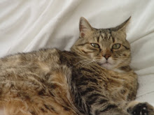
this company makes these based on a picture of your pet, such as...


real beeru:

pillow beeru:


real che:


pillow che:


real opie:


pillow opie:


babies love them:


real titi:


pillow titi:


real nicolas:
pillow nicolas???
pillow pillow pillow.
and a HUGE thanks to my main girl anna for the heads up..not only is she a fabulous and accomplished actress she also has a blog dedicated to all things gluten free.

Thursday, August 27, 2009

color personality

1. What's the first color you see in the morning?

benjamin moore's silver satin or the orangey yellow of my wood floor, depending on which direction i am looking.


2. What color are your eyes?

blue


3. What color do you wear the most?

denim and stain color


4. What color do you never wear?

brown. i look horrendous in it. although brown accessories are nice.
5. What color do you wear when you want to feel sexy?

black i guess?? i usually don't think about a color being sexy for me it's more a shape or a silhouette. although i think wearing this would make me feel pretty sexy.
6. What color gets you the most compliments?

blue
7. What color is your lipstick?

lipgloss when i wear it. nude and shiny.


8. What color was your living room when you were growing up?

white in one house and cream in the next.


9. What color was your bedroom when you were growing up?

pink in one house and cream in the next.


10. What color are your sheets?

white.


11. What color was your favorite crayon as a child?

prussian blue and plum


12. What color is your car?

gross


13. What color was your prom dress?
red. a lot like this...
14. What's your favorite gemstone?

turquoise and rubies


15. What is your favorite flower?
peonies and blue hydrangea


16. What color makes you happiest?

bright pink


17. What color depresses you?

beige
18. What color calms you?

gray
and blue
19. What color makes you grind your teeth?

no one color makes me grind my teeth. but a color used incorrectly can make me want to punch someone. i mean i could say that peach makes me want to grind my teeth, but i have seen peach look pretty. it's all in how you use it i guess.


20. What color would you like to try, but are scared to?


purple

this house beautiful color personality quiz is supposed to tell you something about yourself. i guess it tells me what i already knew..i enjoy the cool colors more than the warm. have you taken the quiz?

Wednesday, August 26, 2009

oh windsor...you are fabulous

after yesterday's example of atrocious design i thought it absolutely necessary that i cleanse my decor palate, and scrub my eyeballs clean with the deliciously expensive and majorly beautiful home of interior designer windsor smith.


her entry is pretty spectacular, no?

as is her eat in kitchen. that stove is killing me. the midnight blue wall is awesome and the stove's knobs match it. oh..windsor!!!!!! the marble hex floor tiles just about send this kitchen over the edge of toomuchmoneyforyourowngood cliff.

tell me, if money were no object would you not have this kitchen?!?


such a pleasing mix of tradition and eclectic eccentric charm.


that pink reminds me of circus peanuts. that is a good thing. it's called pink begonia by b. moore.
her son's room. are you looking hgtv designtards?

this little area is in the master bath.
bedroom love. it looks like it smells really really good.
black walls and glossy black trim for the game room. yes.
later windz! your house is DUMB!!!!!


images via house beautiful.

Tuesday, August 25, 2009

the next design turd

have any of you watched this show? then you probably understand that we are dealing with a bunch of design retarded individuals. so you know, i don't claim to be a designer or even a decorator and unless i go into business as such i never will claim to be. but i do know that i have great taste and a good eye so that if i wanted to i am sure i could be.

let's get to it shall we?

*points of interest: their budget was 5,000 dollars per room, with 20 hours to complete the project.


first up we have jason "i have a vagina" champion. not a champion of design though are you jason?
jason had to redo a 17 year old girl's room who asked for a "sophisticated princess room". needless to say mr. vah-jeen was super excited. he also stated that since the team members were finally getting to do an individual challenge that "the judges would see who the designers were and who the decorator's were". separating the chaff from the wheat, as it were.

here is the before:
here is the after, or the 'wheat'...
you should know that those are place mats he has thumb tacked to the wall as a headboard. and the window "art" was painted freehand by mr. designer. and why in god's name would you get rid of that fabulous bed only to replace it with some jacked up wooden frame and place mats?? i don't think that bed could get any more "sophisticated princess". why not paint that motherfucker instead? and seriously, you couldn't find 300 dollars in your 5000 dollar budget for some fabulous window treatment??? so instead you went with the ghetto graffiti?
was it this built-in nook that sucked up the budget? hmmm....i'm confused jason, where in the high water of hades did that 5000 dollars go? it certainly didn't go toward paint since it's the same fucking paint that she started with.
wanna know what i would have done???
something like this:
yes this room most likely cost more than 5,000 dollars but you could find a great faux fur blanket almost anywhere nowadays for a couple hundred bucks, zig zag rugs at west elm are affordable, that bench and art could be found at a thrift store, target sells a pretty awesome tufted headboard, you might have to splurge on the light fixture and ghost chair but all in all a cheaper version of this room is attainable if you know what in the fuck you are doing.
moving on...


next up is lonni "deer in the headlights" paul.
lonni had a 17 year old boy who wanted a baseball themed room. ok, maybe not the easiest or most fun for a woman to do but still if you are a good designer/decorator you should be able to pull something stylish off with out it looking like a fucking themed room.
to her credit it was a little more chic that just putting up bunting with baseball team flags. or giant baseball wall decals.

this is the before:

here is the after:
ok, so it's not terrible. but it did read little boy as opposed to almost 18.

she made cutouts to look like bases. ok. kinda cool, i guess.
but this would have been cooler:
much more sophisticated color palette and instead of rock albums those could have been blown up images of baseball cards of his favorite players. done. 5,000 could have gone into some really cool modern furniture that he could take with him when he moves out...IN A YEAR!


moving on:
here is antonio "i will kill you later" ballatore.

his client was a 5 year old who liked dinosaurs and spaghetti. as the mother of an almost 5 year old i know that if i asked her what she liked she would most likely make something up on the spot and then change her mind 5 minutes later. for that matter i could suggest that she might like earthy modern decor and she would say yes. my point being you have free design reign with a kid this age.
here is the before:

here is the after:
complete with mdf cave cutouts and stupid dinosaur decals. seriously where did these fucking budgets go to?!?!?! and while i appreciate the photocopied kid cut out why in fucksake did he chop off his legs? and why does a 5 year old need a flatscreen in his room?

again with the cutout bullshit and primary colors. and why does every goddamned wall have to be a different shade of blue? and why so literal?
how about this?

maybe those shelves could display some cool dinosaur toys. i know for a fact target has a bag 'o dinosaurs for ten bucks. way better than stupid decals.


alright...moving on...


here's dan "of mice and men" vickery.


he had an 8 year old environmentalist who wanted an eco friendly room.

here's the before:

here is the godawful after:

so he gave her a big bed, bamboo flooring, some fucking hot pink wooden wall treatment bullshit that he couldn't even center her bed against and painted the walls 2 different colors. why do people think this looks good? it doesn't.i know what you're thinking...DID THE ENTIRE BUDGET GO TO THAT BAMBOO FLOOR??? YOU REPLACED HER PERFECTLY GOOD WOOD FLOOR WITH AN ECO FRIENDLY WOOD FLOOR? IT ALREADY WAS ECO FRIENDLY YOU DIP SHIT! IN THAT YOU DIDN'T HAVE TO FUCKING REPLACE IT!!!!
here's an idea:
take vintage or thrift store pieces and repurpose them. DUH!! fucking rainman.


dear christ, last but not least...


here is torie "gross redneck" halbert.


her client was another young girl, 11-ish i guess maybe younger. loved art and the colors red, blue and green.


here is the before:

here is the after:

so in true designtard fashion she took her child client's favorite colors and ran them all over the place. in the form of the ugliest blue on earth, a brick red shag rug, and lime green fabric wall hangings.

what about something like this instead?
a nice tiffany blue in small doses with little pops of red and green in the form of pillows and small accessories? if she likes art why not give her a parsons table against a wall with like hundreds of dollars worth of art supplies and cheap frames for her to frame her SHIT UP!!?!?!?!
rant accomplished.

Monday, August 24, 2009

monday color combo

how 'bout this gorgeousness this morning? i have gathered (humbly so) the yummiest gray and white decor the interwebs has to offer. i believe everyone needs a little gray and white in their home. AND!!! you can throw any color in the mix and it still looks good. so go ahead all you white wall lovers (that would be me), throw some charcoal up on the walls and behold it's awesomeness and then pat yourself on the back for being so brave. you won't be sorry.


images via juliannemoore'spad, alkemie, annesage, skonahem, apttherapy, candycoloredbudha, countryliving, decorno, decorpad, doorsixteen, marieclairemaison, patriciagray, rightbankleftcoast, windsorsmith, flickr, anna spiro

Sunday, August 23, 2009

chill


this is zoo weather!!
see ya later suckahs!

Saturday, August 22, 2009

things that gave me a lady boner this week

pink kitchen crockery gave me a lady boner this week..
this pink house with black and white striped awnings found via ABT gave me a HUGE LB this week...
this playroom gave good LB. again ABT.

big pile of bright patterned pillows=better move out of the way or my lady boner might knock you down. i'm talking to YOU anna spiro.

these wooden bowls are boner worthy. especially if they are filled with a delicious, homemade ceasar salad.


the idea that halloween is not far off gave me an LB. as did this homemade witch costume.
(*the little girl IN the costume did NOT give me a lady boner you fucking pervert!!!)


kirsten dunst's dress had a huge impact on my boner. for that matter so did kirsten dunst. kirsten dunst IN the dress gave my boner new girth.


lili diallo always gives good bone.


hariett maxwell's living room STILL gives me an LB. the color palette is like a wall of j. crew sweaters. i don't think i could go into her store, ochre without jizzing all over the place. habitually chic has some images of the rest of her house.


this house in denmark seen on remodelista was boner worthy. a place like this would be an ideal summer vacation. not too hot, lots of green and wooded glades and what not...

this house seen on shelter made my lady bits tingle into boner status.

here's to your weekend. may you experience a lady boner or seven.

Friday, August 21, 2009

fear and hope

i read this book before i had a child, i don't know if i could have gotten through the first chapter if i had a kid back then. that said, it still remains the best book i have ever read. i mean in my eyes it's up there with to kill a mockingbird. alice sebold's writing is remarkable. if you have never read it i IMPLORE you to read it. i could not put it down. in fact i remember telling my husband to read it and he was all, "what? whatever...let me see this thing"...lo and behold he was done 2 days later.
so....when i heard they were making it into a movie i was super happy. but also like, no way could anyone ever possibly capture the beautiful storytelling in this book. enter peter jackson. there is a reason this guy doesn't make a ton of movies. because he has a writing team (himself included) that takes their time to adapt shit. 8 years to complete the lord of the rings trilogy. the guy makes beautiful movies. i am a fan. so..while i fear this amazing book could be shafted like all other book/movie adaptations i am super hopeful that PJ can pull it off. if anyone can he can.

i had the trailer embedded here but the powers that be said fuck you. so you have to do the clicking. it's well worth it though. if you like trailers.
http://www.youtube.com/watch?v=kWyNYxGZonI

pedophile beard and rapist glasses

All the Best bedrooms?

ronda carman of the popular blog all the best is having a contest. she will be judging bewteen regulars and designers alike on who has designed/decorated the best bedroom. there is not much criteria to enter other than YOU alone had to have designed the room (your room or your client's room) and it cannot have appeared in any publication (blogs are ok). so lot's of things popped into my head. for starters it doesn't seem fair, i mean should budget be a factor? i am not saying that money buys talent or taste but expensive pretty bedding DOES look better than cheap pretty bedding most of the time. and lets talk photography...should that be a factor? let's face it we all know that a gorgeous room taken by a pro in amazing light will look a lot better than the same room photographed by lets saaaayy...ME! and on the flip side of that an okay looking room photographed by a pro will look a lot better. the winners will consist of a 1st, 2nd and 3rd place along with 3 honorable mentions. 1st place gets some nice sheets, 2nd gets a cashmere throw, 3rd gets a kelly wearstler throw and everyone gets published on ronda's blog.
let's look at some pretty bedrooms shall we?
1.


2. here is a blogger and non pro decorator's bedroom. it belongs to made by girl's jennifer ramos. can you tell the difference between the photography of 1. and 2.? is she standing on a dresser to get this shot? and this is a pretty bedroom but it's kinda blah, no? perhaps a little more styling and a different angle would have made this better.


3. this next one is pro all the way and LAAAARGE budget.

4.

5. if fur flooring is in your budget you might have an advantage.

6. this is another blogger's bedroom. it belongs to frou frou fashionista. she is not a pro either but owns a lingerie store. it's pretty isn't it? but again, the photography doesn't really do it justice. she should enter the contest though.

7.
8. pro and budget. porthault sheets and GORGEOUS wallpaper. this is a dreamy, cozy bedroom. and if this popped up in the contest over say that jennifer ramos one how could you not vote for this??? the styling, photography, luxuriousness it all counts!!!!


9. a kay douglass classic. super simple but super chic.

10. i love this bedroom. it looks less designer-y than some of the others. i like that. it looks doable. effortless. i'd vote for this one.

11. this bedroom comes from my beloved jamie meares of i suwannee. she's not a trained designer either but she has crazy talent. even with the stuff on the bed and cord front and center this room looks good. i can relate to it. that says something.


12. here is an example of a room designed by a non designer without budgetary restraint. she obviously has great taste and it helped her tremendously to be able to buy whatever she wanted. i LOVE this room! it is one of my all time faves. that rug makes me go koo koo.
and i want to rub my freshly cleaned face into those gray linen pillows!!!


13. this room is in some french chateau somewhere. i have always loved it. beams + triangular shape+ brick tiles= cozy bedroom. this room has amazing bones, i don't think you could fuck it up.
14. another blogger bedroom, this time in the form of the visual vamp's valorie hart.
this room is soothing and calm. that picture over the bed seals the deal for me. 15.
16. this room is another all time fave. doesn't look too pro and it looks completely attainable and GREAT photography sells it.
17. another example of amazing bones in a room. some gorgeous wallpaper, bedding and a statement light and yer done.
18. small space gorgeousness. a pro though. lee kleinhelter of pieces inc. dark gray walls, white tufted headboard---jiiiiizzzz! the way that mirror reflects the chandelier is KILLING ME! unless it's photo shopped in. hmmm....

19. i want to see more of this room. i am not a fan of the half picture of the bed thing. what the fuck is the point of it?
20. symmetrical perfection. and i mean that it's symmetrical without being TOO symmetrical. different tables, red thing on one side. good. amazing bed. subtle wallpaper. fabulous window like mirror reflection the outside. all of it is used to accentuate the height of the ceilings to amazing result.


so what do you think? am i being too critical? or do i bring up valid points? ronda if you are reading this what do you have to say about MFaMB's criticism of your contest?
i guess the bottom line for me is..if i was entering this (which i am not) with my bedroom which would be mine since i have never decorated anyone elses other than my 4 year old's, the budget would be very small. now even though i consider myself to have good taste and a good head for design and/or decor i don't think i would stand a chance against someone entering this contest with equally good taste and a big budget and a great photographer. know what i mean? are you picking up what i am putting down? i guess we will see.
thoughts? comments? concerns?

Thursday, August 20, 2009

i got sumthin'...

it's my LA party pad. wipe your feet off on my rabbit and come in. oh you noticed my hot pink railing? it's rad isn't it? sit down here in my fire pit lounge and let me get you a drink. we have a rule at party pad...all drinks must have ice and go "clink, rattle, clink" when you gesture. there is a lot of gesturing in LA.
later i will serve you some delicious food in my fabulous dining room. doesn't everyone have a pheasant lamp? well they should!! gesture gesture..clink clink.


lots of cooking happens in here. good cooking. good looking cooking. see all of my oils and fancy condiments? that means i know what in the hell i am doing in here.


you can swim too if you want. or sit next to my orange fireplace. we can gather round and talk about what a douchebag jeremy piven is. although keep your voices down he is probably at my party.


here is the other side of my fire pit lounge. this is where the smarter people tend to gather. you won't find ME here!!


here is my bedroom. lots of times the parties end in here. i'm just sayin'.


that's my robe. that arrow helps me find it when i have had too many parties.


i'll do a swim-by when you are in the shower.


a lovely room don't you agree?


i give good party.

i got nuthin'....

no design post at the moment. sometimes the creative juices just don't flow. i'm not a machiiiine!!!!!!!! but i will tell you about something yummy i discovered. they are sweet potato chips and beet chips. i LOVE beets. just discovered those too about a year ago. something about their earthy dirt taste that makes me giddy. roasted and drizzled in truffle oil is best but these are pretty good too. i like to scoop up tuna salad with them. much healthier than bread or a cracker. and delicious. try them.


Wednesday, August 19, 2009

the winner

after a long battle in my head i have decided that the buffet will be painted farrow and ball's hague blue:

it is the perfect shade of sapphire-ish-peacock-y-mysterious blue. it will get 2 coats of oil based high gloss love. below is someone's bureau painted in hague blue. you love it too don't you?

here is a room painted in hague blue. it is almost black and most likely would read black at night. i love that aspect of it.


gran thinks it's a kick ass choice!
so now i must find the perfect pulls and hardware bits....sigh. i have no idea what i want.

pottery barn has pushed a button

somehow this room appeals. nothing makes me want to pull my eyelashes out more than an over styled bed but i was able to overlook it this one time. back when MFaMB was a young girl in the 70's this is the bedroom my neighborhood bestie had and i loved it. while i was swimming in a sea of red shag and pink walls covered in posters my neighbor was living in a pure blue, yellow and white botanical heaven. something about this room SCREAMS at me to shut my eyes and remember the good ole days. the clean, plush low pile carpet, the silence and frosty cold of a good air conditioner, the matching white bedroom set with all of her tchochkes (including but not limited to a silver brush, mirror and comb set, several well placed unicorns, kitten bookends holding the entire judy blume collection in place and a music/jewelry box with a twirling ballerina) and us sitting on her perfectly made bed discussing what we were going to do that day.


if fiona asked me for this bed i fear i would have to give it to her.


Tuesday, August 18, 2009

new bits

The Twilight Saga: New Moon 'Meet Jacob Black' Preview in HD

thanks and tongue kisses...

thanks to everyone who offered advice. it is so helpful and i am beyond appreciative. special thanks to urban sardines and wanderings of a wannabe for the links to love. so now i am narrowed down to 2 color choices...this one (only shinier and with a tinge more peacock/sapphire)...

or this: shiny orange and bright...

remember this from cottage living?


decisions. thoughts?

can i get a little help here?

project buffet makeover is well under way here at the andrews-anderson house. however.


i can't decide on paint. i WAS going to go with a glossy white but decided it was too boring. why not add some brightness to my dining room? i am thinking of 3 colors but just can't commit. i need my readers to help me.
i saw this image over on i suwannee via matters of style. and while a petite bamboo desk and a huge, chunky buffet are drastically different, i DO enjoy that pop of red in a room. i just don't know if an EXPLOSION of red is in order.
i am also madly in love with all of these midnight and peacock blues i am seeing everywhere. shiny and dramatic and moody blue? can you picture it? my fear with this is it will be too dark and not translate as well and be..well...too heavy? what say you?
i am also thinking yellow, like this ikea cabinet/buffet. i am open to any suggestions and images you might have. help me.
hey...nicolas bb...what do you think?

sidenote:
i feel it is my duty as a design blogger to explain why someone who claims to have impeccable taste would have such a hideous chair. let's just say that when we went to look for a chair the room it was intended for was a bit on the cabin-y side. i thought this chair would look nice next to the entire wall of brick fireplace. and really at the end of the day it's not the fabric its the chair's lines that suck.

Monday, August 17, 2009

sorry

a while back i had some richard cranium aka dick head playing a "i'll have the last word MFaMB!!" game with me on my blog. so i added the comment moderation...i showed them!!!
well, i just noticed that i had a whole SLEW of comments from my sweet and awesome readers that i had not moderated and that makes me sad. i love my readers and their comments. even the douchey ones. so if you are/were a MFaMB reader and noticed that one or more of your comments hadn't been published i am very very sorry. i have taken comment moderation off so that i don't have to deal with all of that stuff anymore and so no one feels like i don't care about what they are saying. i will just deal with the mean comments the way i feel works best...with a knuckle sandwich.

reader request

this afternoon i received this lovely email:
Hi Jenny,
Your blog is one of the joys of my day so thank you for putting it out there. I'm trying to decide on paint colors for my living room and I'm leaning towards a limey, acid green (a light one, not a really bright one). Do you have any suggestions for specific colors? You are so spot on with every damn thing you say that I had to ask your advice. Choosing the right color is killing me right now and I think I need an intervention. I'd be thankful for any colors you might be digging. Thanks so much,
Kris
p.s. -- your post on John Mayer (crapweasel) was so great. He's on my most hated list and his dumb apartment will keep him there for good.

ok kris...first of all thank you and secondly i think if you are leaning toward lime green you must like it so go with it!! i think lime green can be a neutral or that bright pop of color a room needs, depending how you work it.


this image's green seems a bright olive, pretty with the chocolatey browns and muted pinks and golds.


this green room keeps the green alive in the curtains and chair fabric as well, all different hues which works well. the wood tones and creamy white keep it earthy and calm and not too serious. and those little turquoise moments liven it up.

while i am not a fan of the black and white fabric parade on the wall (what is that a mood board?), i do love the green with the soft gray blue daybed and the black and white striped rug. the woven chair and basket all help to warm it up.

if you are not ready to commit to green walls, this should help you see how a little bit of green can make a wonderful impact. and notice how crisp it all looks. the white walls, striped cotton rug, dark wood. all of these colors are refreshing, clean and modern and still warm and friendly.
i chose this next image b/c i guess i wanted to show you how many different ways you could go with green and still make it work.

this is a bit less extreme than the last one but still uses a lot of different bright colors to create a fun and inviting space. the crisp whites and natural rug ground it out. important if you are using bright colors.


or you could go a milk chocolatey brown with white and lime accents. i do like this combination. it seems warm and cozy without being too boring.


kris my darling i hope i have helped in some capacity. unfortunately i am terrible at committing to color in my own home. so i feel your pain. in fact my home is a mixture of whites, grays, black and wood tones. shock and horror!! i was gearing up for a post about the buffet i started to sand and paint this weekend. i couldn't decide on color!! so stay tuned for that one.
now i leave it up to MFaMB readers to chime in if they have any advice to give.
what say you?

monday color combo

good monday to you loyals and faithfuls and newbies alike! red and blue is a good way to start the day, no? bright, happy, dramatic, fun? hopefully this installment proves that red and blue can work without making you think of the 4th of july.
images via ABT, flickr, alexfalkiner,coastalliving, countryliving, domino, housebeautiful, husandhem,casasugar,livingetc, lulupainting, mynottinghill, seasonsforallathome, willowdecor

Friday, August 14, 2009

respite

normally i am a 7 day a week blogger. i mean it's not like this is a job and i need the weekend to be or do something else. no, i blog when i want to blog. sometimes that's 3 times a day, sometimes once. but always 7 days a week. well, this weekend i am not going to be blogging. i am going to be doin shit. cooking lobster chowder and chocolate cake for a certain mother in law. mine, duh. and then she and i are going to get into some furniture refinishing. nothing crazy, just a buffet in need of some shiny white love. don't you worry your pretty little heads though- i will be posting all about it very soon.

in the mean time please do enjoy this very cute bedroom/office i spied over at m. design. please consider the pink walls, window treatments, blue chair and brown funky graphic rug.


peace out my loves.

you can do it!

this morning i saw these dorothy draper-esque chest of drawers at pieces, inc. for 3800 dollars.

that's a hell of a lot of money when you could pretty easily rip it off with a malm...

or a kullen (you could call it a cullen, i wouldn't mind)...


some of this...


a little of this....
throw on some of these and BAM!


you now have some dorothy draper inspired chests and you didn't have to sell your soul to the devil.


Thursday, August 13, 2009

jizzing

these knuckleheads are gonna have their own show. don't know who they are?now do you? why, it's the husband wife team of sixx design. as in six kids.

the show will (thankfully) be on bravo. here is a blurb from the bravo website.

DESIGN SIXX (working title)
Husband and wife design team Cortney and Robert Novogratz have made it their business to seek out abandoned buildings across Manhattan. Their company, Sixx Design, has established an international reputation by taking those buildings and transforming them into multi-million dollar living spaces. But the Novogratz's are anything but your typical house-flippers. In addition to living in each of the homes they flip, the couple brings along their six children all under the age of 11 and Cortney is pregnant with a seventh child on the way. Life is chaotic for the family, but from chaos comes clarity with Cortney and Robert and their design team. "Design Sixx" (wt) is produced by Left/Right for Bravo. Ken Druckerman and Banks Tarver serve as executive producers.

i can't seem to stop barfing..

it may come as no surprise to you that i think this guy is a douchebag. why? he's so cute? you ask. i GUESS he's cute but moreover his music sucks a GREAT BIG dick, i like to call it "whiny pussy music". plus it seems to me like he is a bad boyfriend. playing girls like some people play his boring music: obviously and too much.
i liked him for a second when this picture of him surfaced. but then i heard his music again and my ears started bleeding. this picture was useless in his defense.

so it should come as no surprise to you then if you are of the same opinion as me that his NYC apartment is as boring and manufactured and soulless as his music. it was designed by the armani casa team. and yes, they used EVERYTHING from their line. so if you say to yourself that his place looks like an armani casa advertisement. you would be correct.


snore.

yep..everything you see..mirror, bed, bedding, rug, tables, lamps...armani casa.
all of it. armani casa. except the guitars. quick someone destroy them!!!


fortunately that's all point click home would give up. but i have this issue and it's just more from the armani casa catalog. i think they might even make kitchen cabinets.


Wednesday, August 12, 2009

come on in!

oh hiiiii!!! sorry for the late post. i have been here all day doing a whole lot of nothing. this is my california mountain retreat.
step thru my hall. those pink doors hide party favors and extra blankets and pillows for my guests..
sometimes we sit in this room and just talk and stuff. it's CrAAAAzy!!!!

you could sleep here...

we could squeeze fresh lemonade with lemons from my lemon tree...


i sleep here..


sigh.

Tuesday, August 11, 2009

bored i tell ya...and hot too.

around fall while most of you are lusting after a closet full of j. crew cardies i am wondering when the fuck good tv comes back on.
like this show:
and this one:

i love when a show can round up some hillbillies and get them lost and completely out of thier element, racing against harvard grads and the like for a million dollars. hillbillies....salt of the earth i tell ya.

and this one:


and this one:
i hear padma's padma'd on a few lbs. good for her. i love when the skinnies get a little chunky. yeah, you keep eating that chocolate padma.


and this one:


honorable mention:
**the office
**30 rock
**america's next top model
** get your shit together or we're through.

more from m. design

more and more i am starting to really adore this california funky modern brady bunch thing. probably b/c it's so different from what i have loved in the past. i still think that when you throw a few frenchy antiques in the mix it works even better.
or is it california funky modern granny? cuz i could TOOOTALLY see bea arthur here.

Monday, August 10, 2009

bananas

as in the amount of color in this house is bananas!! a lot is going on in this here kitchen. what are we thinking about the yellow stripes on the ceiling?i dig it. we all know a puppy scores points. especially the loaf of white bread variety.
i heart this bedroom and it's coziness. that wallpaper, those lamps, that reading nook...
this bathroom is funky. very pleased with the addition of flat screen. and i am not mad at those necklaces either. pom pom blankets are very, very good.

this house is in laurel canyon, CA (essentially up in the hollywood hills). designed by these folks. and found for me by this lovely lady.

monday color combo

today's combo is sadly too small. at the risk of inundating you with crafty etsy lavender and orange rucksacks i chose a smaller gathering of photos. truthfully there just isn't a lot of lavender, violet or purple paired with orange, peach or ochre in the world of interiors. too bad, i think it's such a lovely pair.


images via decor8, alkemie, thecitysage

Sunday, August 9, 2009

fuck you little debbie

i make my own oatmeal cream pies....


from scratch, hooker!

this should knock you out

spotted on a monday color combo search...holy fart! where have you been all my life beautiful bathroom? that wallpaper kills me, that lamp is harassing me with its cuteness, the black cabinet and marble counter is laughing at me and the floors are using my face as a punching bag.
if you know what's good for you you will click for enlargement purposes.

i think at some point this picture was on desire to inspire (what isn't?) but i have no idea the original source. tell me if you know so that i can stalk the designer.

Saturday, August 8, 2009

skyscraper lunch

most people i know are pretty scared of heights, myself included. however i might fall into the category of terrified of heights. these photos are preposterous to me. i am utterly amazed that men (maybe women?) actually did this sort of thing back in the day before we had the harnessing and suspension doo-dads we have now. seriously, these photos are not doctored. i wonder how many lives were claimed due to this type of work. you know it must be up in the hundreds if not thousands. this is how our skyscrapers were built!! think of that the next time you're in NYC.

"These photos depict scenes of workers who participated in the construction of skyscrapers between 1920 and 1935."


Friday, August 7, 2009

i hope she has good deodorant


look, i'm as big a fan as anybody of jane aldridge and her fashionably awesome blog, with all her vogue write ups and a teen coolness the likes of which i certainly have never seen...but...she lives in texas. texas. right now in texas it is 99 degrees. here in atlanta it is 96 and i am wearing a thin cotton t-shirt and denim cut-offs and i am sweating balls. loco. fabulous....but loco.

r.i.p.

dude. this movie kinda sorta made me who i am a little bit. i remember that a.) i was OBSESSED with molly ringwald and her outfit in the movie. which only got worse when pretty in pink came out. and b.) i was in LOVE with judd nelson. so if you haven't heard, john hughes died of a heart attack on a morning walk in manhattan. bummer.

what was your favorite john hughes movie?

Thursday, August 6, 2009

the mind she does boggle

how can i love this.....

as much as i love this....?

do any of you freaks suffer so?


sorry, i forgot where these images came from...let me know so i can give creds.

it's about time

i'm just sayin'...in sea of princess whitey's and one middle eastern, one american indian and one chinese princess it's about fucking time disney stepped up and gave us a black princess.

i am happy for little black girls everywhere.

thanks barack obama! i don't think white corporate america could have done it without you!

Wednesday, August 5, 2009

good and cheap in a small space

i like mirrored backsplashes. not only does it open up a tiny space but it adds a much needed shine and glow to an otherwise wood heavy space. plus it speaks to my inner clean freak in that the splatters and smudges would stick out like a sore thumb making clean up necessary and easy. i never understood why people would choose things for their home (i.e. carpet, rugs, upholstery, tiles, counters etc..) that "hide the dirt". not me!! i want to SEE it so i can CLEAN it! ok, maybe on the rug front i can see hiding the stains and dirt but ONLY b/c rugs aren't so easy to clean, or cheap if they are to be professionally cleaned. anyway...i digress...mirrored backsplashes? thumbs up!


here is a perfect example of an otherwise cramped space, heavy with wood cabinets getting a much needed does of sparkle with the mirrored backsplash. as well as opening the space up it also gives it a little sophistication. did i mention it was cheap too? i mean in comparison to shiny white subway tiles anyway...


miles redd went one step further and mirrored the counters too! he must really hate dirt as well and probably cleans like me. besides are you really ever gonna dispute miles redd's choices? i thought not.

images via twotallgirls, maggymoon, AT, housetohome, dcdigs, architectdesignblog, miles redd

Tuesday, August 4, 2009

not boring

as someone who writes a primarily design based blog and immerses herself in a sea of interior decor i feel like i have seen it all (you have too, i know) and am a little starved for something different and new. somehow for me, this kitchen below dances to her own tune.
why would i think that? not sure. i mean open shelving, pendant lights..not new but with that farrow and ball wallpaper it's a little quirky and fun. i like it. your thoughts? am i just on crack? is my lack of sleep last night contributing to this completely ridiculous, question heavy post?
maybe it's because i FINALLY finished the twilight series last night and i just miss my boyfriend already. speaking of...can we discuss the incredibly LOOOOONG denouement that is the last 100 or so pages of breaking dawn?? i kinda want to karate chop stephanie meyer. i am sure i am not alone when i say all we really wanted in those last 100 or so pages was a whole lotta vampire sex. maybe even a vampire orgy. i mean they were all gathered...right? carlsisle and esme could have gotten the ball rolling with some steamy kissing, then you KNOW emmett and rose would have jumped in there to take it a step further with some heavy petting, maybe emmett's shirt would have come off revealing his hotness...edward would have said to bella..."this is how vampire's celebrate a victory...we all do it with each other!" bella would have been scared but once edward stared kissing her it wouldn't have mattered what he asked her. don't worry! jacob would have taken renesmee to a playground or something. alice would be all, "i knew this was going to happen". you feel me?
now where was i?

Monday, August 3, 2009

monday color combo

it's no secret that i love the color gray. such a sophisticated neutral. it goes with EVERYTHING!!i have loved the gray and pink pairing since very early on. i think it all started with a pair of pale gray nikes with a pale pink swish (swoosh?) when i was about 9 or 10. i love this combo in everything...clothes, rooms, shoes, feathered friends...it's so delicate and soft. dreamy.


images via elle decor, decorpad, marie antoinette movie via vogue, houzz, likeitwas, living etc, martha, nadiaisobel, westegg, patriciagrayinc, cote maison, flickr, skona hem, vintagegoodness, southern accents, sweethomestyle, weheartit

this should get things going for you this morning..

Sunday, August 2, 2009

sunday series, what flavor?

'nicolas bb' aka 'decadent dd' aka 'b'. an average winter's day in the anderson household.

Saturday, August 1, 2009

best thing i've seen in ages

found via here.

really?

this is a joke, right? only on european beaches, right? and even then, REALLY?!

my alter ego....

an oscar winning actress/interior decorator/architect/cookbook author who lives in london wears these clothes this fall...


all outfits tory burch fall 2009 ready to wear.